
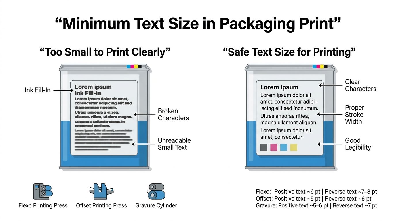
n packaging artwork, designers often try to fit a lot of information into a limited space.
Ingredients.
Legal text.
Instructions.
Batch information.
To fit everything, the text size is sometimes reduced too much.
On screen, it may look sharp and readable.
But in print production, **very small text becomes a major risk.**
Why?
Because printing is not perfectly precise.
Ink spread, plate distortion, and substrate behavior can affect fine details.
If the text is too small:
🔹 Characters may **fill in with ink**
🔹 Thin strokes may **break or disappear**
🔹 Reverse text (white text on dark background) may become unreadable
🔹 Regulatory information may become difficult to read
These problems usually appear **only after printing begins.**
That’s why prepress teams follow **minimum text size rules** depending on the printing process.
Typical safe guidelines in packaging printing:
Flexo Printing
• Positive text: ~6 pt minimum
• Reverse text: ~7–8 pt minimum
Offset Printing
• Positive text: ~5 pt minimum
• Reverse text: ~6 pt minimum
Gravure Printing
• Positive text: ~5–6 pt minimum
• Reverse text: ~7 pt minimum
Font style also matters.
Thin serif fonts are more risky.
Simple sans-serif fonts usually print more reliably.
In packaging production, **legibility is not just a design choice — it is a production requirement.**
Good prepress work ensures that important information remains readable from design to final printed pack.